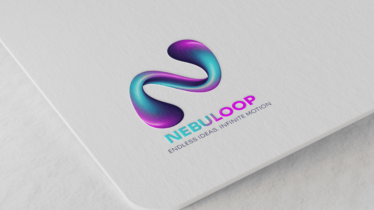
Nebuloop Logo


The design features a fluid, abstract “N” formed from a continuous 3D loop. This vibrant form captures the essence of what we stand for: endless creativity, dynamic thinking, and seamless flow between ideas and execution.
Shape & Symbolism
The looped structure represents continuity and connection, echoing how we merge design, motion, and imagination into a unified experience.
Its flowing curves mirror our core belief: great ideas don’t follow a straight line — they evolve, adapt, and loop back stronger.
Color Palette
The electric turquoise and vibrant violet gradients convey energy, future-forward thinking, and a sense of digital fluency.
These colors were chosen to reflect both creativity (purple) and technology (aqua) — our two guiding forces.
Modern, Minimal, Memorable
Designed with clarity and boldness in mind, the logo stands strong both in motion and in stillness. Its sculptural quality makes it instantly recognizable across digital and print platforms, while still feeling alive and adaptive.
